The collections presented at Milan this year seem to have reflected the designer's limited ability to deliver striking pieces, but maybe this is partly due to a change in the overall ethos of men's fashion. The extravagance has been toned down, with designers showing much simpler designs, focused on the rise of digitization and cleanliness of men's fashion. Of all the designers and labels who showed, besides Emporio Armani and Ermenegildo Zegna (reviewed in previous posts), notable Spring/Summer 2014 collections included Corneliani, Neil Barrett, Bottega Veneta, Iceberg, Fendi and Z Zegna.


Simplicity is the key theme of Corneliani's Spring/Summer 2014 collection, but it certainly isn't shallow. Although the crispness of simplicity is commendable, the attention to detail is what makes the collection a stand out. Creased collars, asymmetrical closings of coats and gradient circular tessellated print are plentiful in the collection, and are not necessarily easy to be seen, hence one's questionable first impressions of the collection are undoubtedly made false. A refreshing colour palette of white, nudes, navy blue and hints of teal emphasize the discreet details.


It's a risky venture for a designer to re-appropriate a classic pattern for the sake of revival, but Neil Barrett has done so without creating a tacky feel to the pattern. Checks came back into the forefront of fashion with the Louis Vuitton Spring/Summer 2013 collection, but no menswear designer has effectively reflected that successful comeback since Marc Jacobs. The dissection of the checkerboard has appeared as an interesting motif throughout the collection, overshadowing the other details including curvaceous panelling, ribbed neoprene shirts, zipper pockets and texturised stripes. Imbalance is present, but execution of modernising the pattern is successful.
Bottega Veneta
Bottega Veneta


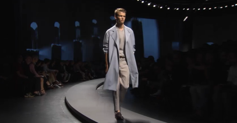
As an avid fan of Bottega Veneta, it was no surprise that I would feature their new collection in my review of Milan Men's Fashion Week. Their signature aesthetic is apparent, with the calming colours of concrete, navy blue, sharp black and earthen browns and reds heightening the sombre diamond and iron grate patterns and embroidered stitching that flow throughout the collection. To many who are unaware of this illustrious label, the collection may seem tame and boring, but one must look further the craftsmanship of the pieces to appreciate its bespoke wonderment.


Integrating artworks into fashion is another difficult endeavour taken on by fashion designers worldwide, and sometimes turn out catastrophic to both the credibility of the designer and the dignity of the artist. I cannot say this is the case for Iceberg, their careful selection of abstract artistic patterns easing into the structural, yet relaxed, look of the pieces within the collection. Panels of white and pops of orange are vivid, but no other detail within the collection stands against the artworks on the sweaters.
Fendi


The desert stormed through Milan and is set to next season with Fendi's latest offering for the hotter months, just as they intended it to. The sand-covered runway fit perfectly with the Saharan-Mediterranean theme, making obvious the connection between the clothing and the ethos of the collection. Lightweight fabrics such as silken shirts, amassed with dusty and earthy prints, and wide-necked Sicilian shirts juxtaposed against the heavy leathers and out-of-context oxfords bring a modernity to the Ancient connotations of the collection. The fusion of past and future are clear with the structured feel of the garments and the colour palette reflecting the colours adorned by Desert Kings.


The classic Zegna aesthetic has been glorified once again with a Spring/Summer collection from Paul Surridge. The enclosed, futuristic space in which the collection was presented contrast to the seemingly relaxed feel and look of most pieces within the collection, particularly shirting and bottoms, which loosely fit on the body without blatantly hiding one's shape. A contemporary take on the honeycomb pattern is motif within the collection, with quilted jackets and leather jackets donning the pattern via embossing. In addition to this, a retake of the kaftan shirt, patterned trousers and kimono shirts deepen the relaxing vibe of the collection.
Images courtesy of Fashionising